FUJIKURA / 2027 CALENDAR
2027 캘린더 비주얼
월별 기획 · 이미지 디렉션 · 후보정 · Photoshop 합성
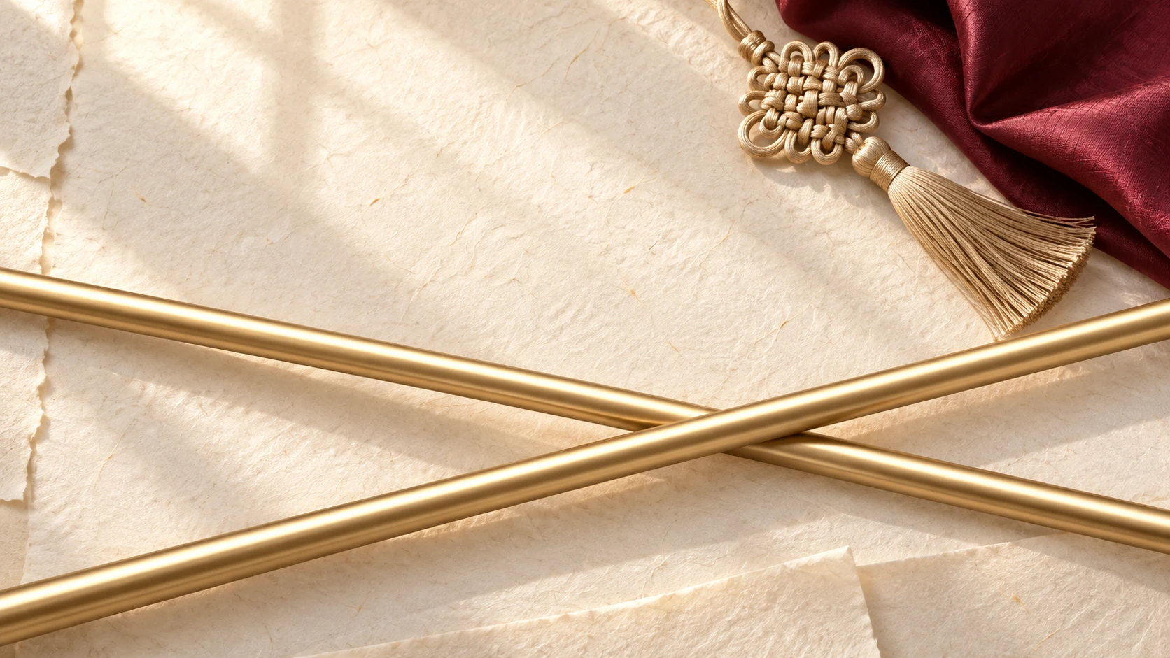
FEBRUARY · 설의 빛과 NX GOLD
JULY · 여름 물빛과 AIR SPEEDER
SEPTEMBER · 가을빛과 JADE SPEEDER
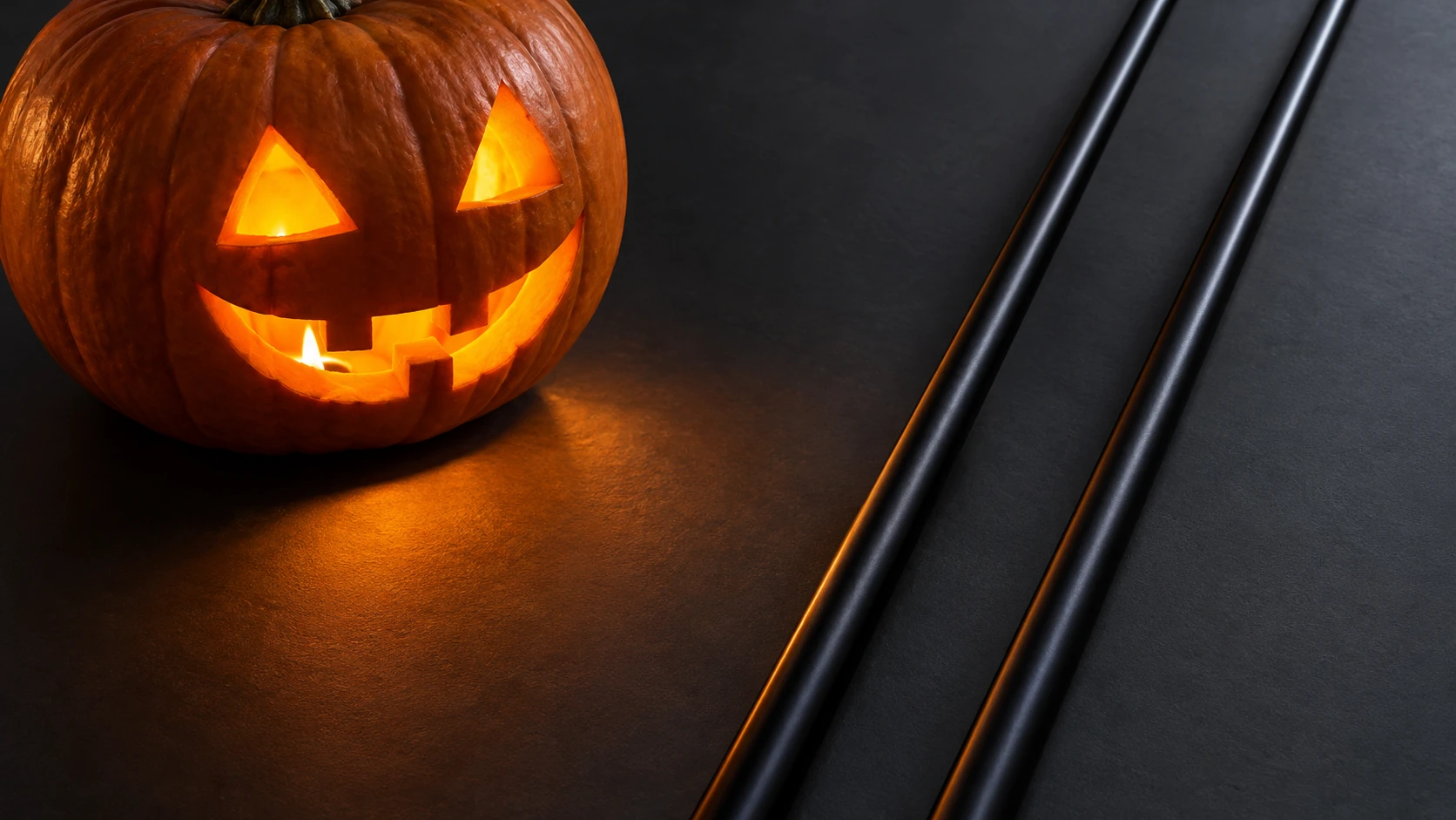
OCTOBER · 할로윈과 TRAVIL
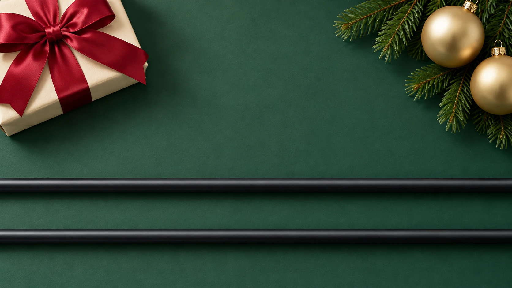
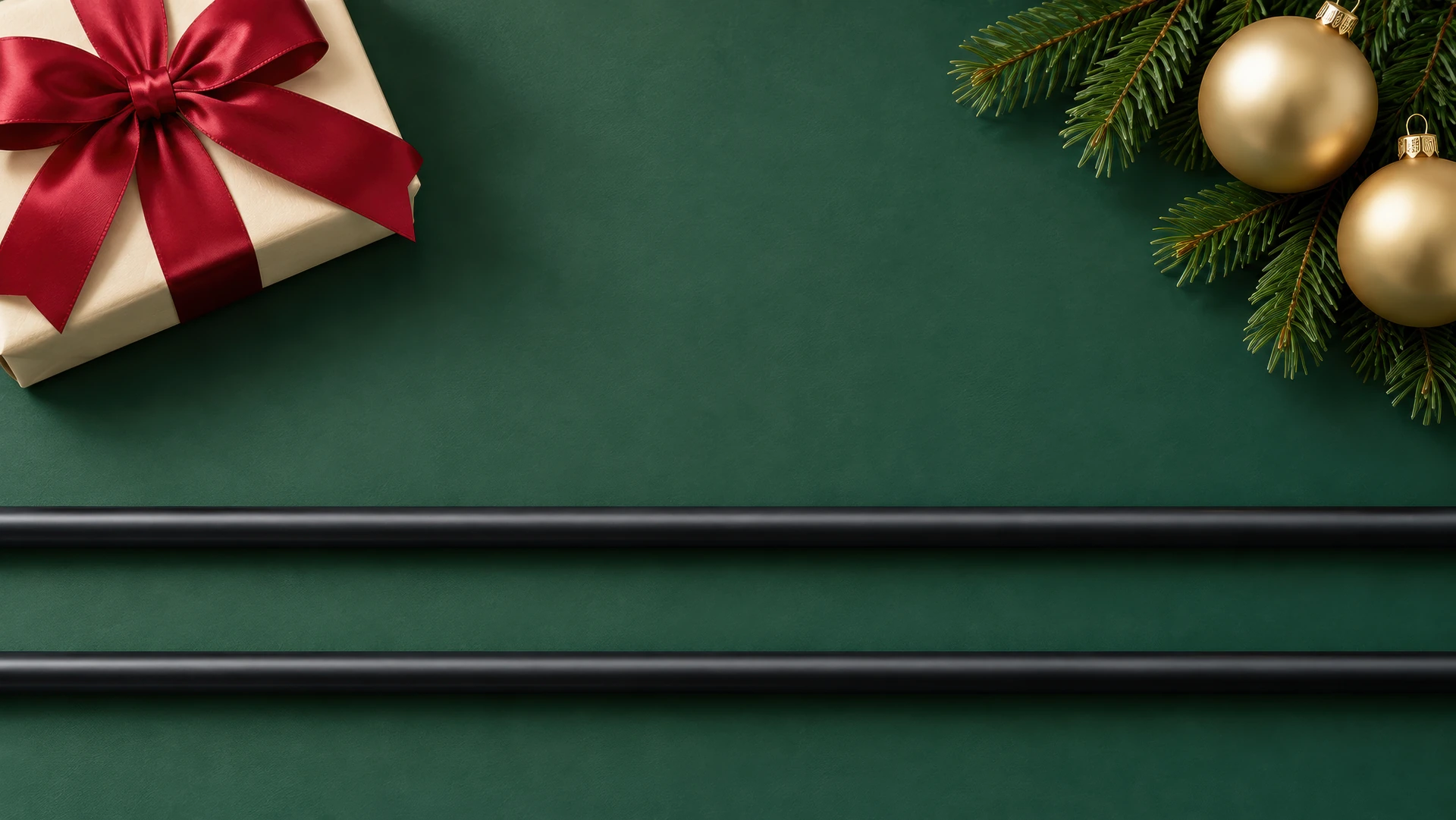
DECEMBER · 홀리데이와 VENTUS RED
프로젝트 기획
- 콘셉트
- 제품색과 월별 계절 소재의 조합
- 선정작
- 2월 · 7월 · 9월 · 10월 · 12월
- 제작
- 배경 생성 / 후보정 비교 / 제품·타이포 합성
이미지 생성 · 후보정 · 합성 기록
배경 생성
- 도구
- ChatGPT ImageGen
- 조건
- 소재 · 조명 · 제품 중심축 · 굵기 · 소품 배치 범위
- 영문 프롬프트
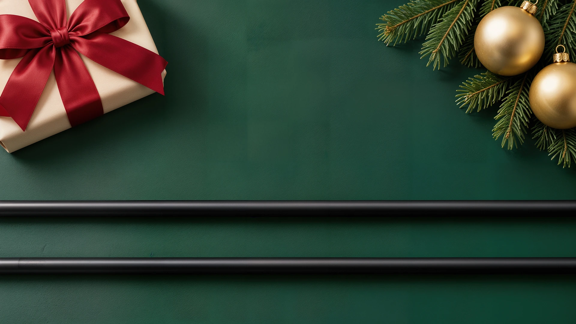
- 2월 · 10월 · 12월 배경 생성 기록
Use case: ads-marketing.
Asset type: February NX GOLD calendar compositing background, new 16:9 landscape photograph with two blank gold shaft placeholders. Premium Korean Lunar New Year product advertising with refined complete art direction, layered real materials, coherent lighting and a distinctly ASYMMETRIC CROSSED composition.

SCENE: predominantly near-white warm ivory handmade Korean hanji paper, subtle true irregular fibers, several nearly flat overlapping sheets with gently deckled edges along the left perimeter and one softly folded edge near the bottom margin. Broad warm window daylight from upper left creates visible soft tonal variation and shadows across the whole paper, with beautiful tactile surface detail. Natural ivory, never strongly yellow or sepia. A grouped festive still-life at the UPPER RIGHT: one authentic Korean maedeup knot made from champagne-gold braided silk cord with physically believable interlaced loops and a short neat tassel, next to the cropped corner of a deep burgundy silk bojagi cloth with subtle visible weave and elegant folds. The cloth enters only from the top/right edge, concentrated in the upper-right quarter. The knot and tassel remain entirely above about 37% of image height. Materials read as silk cord, silk fabric and hanji, not molten metal, plastic, clay or painted illustration. Rich gentle gift-like Lunar New Year atmosphere and thoughtful object placement rather than an empty paper template. No lanterns, coins or extra festival props.

ROD COMPOSITION: exactly TWO separate blank satin champagne-metallic GOLD cylindrical golf-shaft placeholders. They CROSS ONCE around x=60%, y=65% of the canvas, forming a shallow, asymmetrical X. The PRIMARY foreground rod runs from the LOWER LEFT at y=90% to the RIGHT edge at y=48%, rising toward the right. The SECONDARY rod runs from the LEFT edge at y=48% to the LOWER RIGHT at y=76%, falling toward the right. Both extend beyond the left/right edges. The primary goes OVER the secondary at their one crossing; clear coherent over/under depth and realistic small contact shadow there. They are two individual continuous straight cylinders, not welded, connected, bent or fused at the crossing. No horizontal parallel two-row arrangement.

ROD SHAPE AND FINISH: measured from actual NX GOLD product silhouettes before generation. These show cropped thick-to-mid sections with a gentle locally visible taper, not the full shaft butt-to-tip taper. At an approximately 1672x941 output, each rod is about 36px thick at the left and 33px at the right, measured perpendicular to its axis. Scale proportionally with output size. Both are slender, with clean continuous slightly converging edges and smooth controlled gold highlights, realistic dark gold midtones and a narrow soft specular band. No dramatically pointed thin end, no constant-width chunky pipes, no clubheads, grips, caps or ferrules. Pure unprinted champagne gold surfaces: no real shaft lettering, logos, stripes, patterns or specifications.

COMPOSITING CLEARANCE: the ONLY allowed occlusion is the deliberate rod-over-rod crossing. No knot, tassel, cloth, lifted paper edge, petal, leaf, ribbon or decoration may cross, touch or cover the rod surfaces or their silhouettes. Keep all such objects and raised folds completely outside both rod corridors. Paper layers beneath rods remain flat. Make the crossing easy to understand, with accurate source-friendly perspective, camera overhead / near orthographic and no dramatic longitudinal foreshortening. Shallow natural cast shadows on hanji unify rods with the scene.

LAYOUT: balance the crossed gold rods across the middle/lower image with the upper-right knot/burgundy fabric grouping. The upper-left/upper-central paper has gentle grain and broad window-light modulation suitable for later product typography, integrated with the scene rather than a blank reserved box. Varied photographic depth and clear visual hierarchy. Warm elegant celebratory art direction, sharp believable hanji fibers and silk weave, finely controlled highlights, no excessive grain or smeared AI texture.

No words, numbers, branding, logo, calendar grid, watermark, artificial graphic rules, diagrams, borders, snow, ice, scenery, sparkles, neon, smoke or glowing beams. Full-bleed finished background plate only. Highest available native resolution, ideally 3840x2160, landscape 16:9.
후보정 비교
- 도구
- Topaz Gigapixel 8.4.4
- 12월 비교
- 1672 × 941 → 3344 × 1882px · 2배 확대
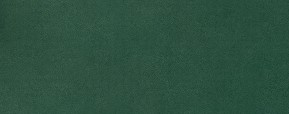
- High Fidelity V2
- 장식 형태와 배경의 고른 톤 보존 · 추천안
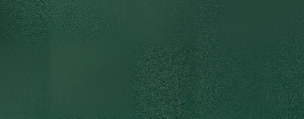
- Redefine Creative
- 장식 재해석 · 바닥 질감 불균일 · 비교용
제품 합성 · 인쇄
- Photoshop
- 실제 제품 스마트 오브젝트 · 배경 · 타이포 분리
- 10월
- 주황 반사광을 별도 소스로 분리
- 인쇄 데이터
- RGB 원본 보존 · CMYK 별도 변환 · Coated FOGRA39